UI/UX Project - The Skate Shop Website
CLIENT: The Skate Shop - Part of the UX Google Professional Certification Course
PROJECT ROLE: Project Manager / Lead UX/UI Designer, designing a Website for The Skate Shop from conception to delivery
RESPONSIBILITIES: User research, conducting unmoderated usability studies, paper, and digital wireframing, lo-fi, and hi-fi prototyping.
THE PRODUCT:
The Skate Shop website sells several products, parts, and accessories for skateboards. They want to promote their wide range of products and “put” their business online. Their customers are teenagers, adults, and students also, who have experience or not in skateboarding activities.
THE PROBLEM: Create and develop a website with a clear UX and UI for users to find and buy the shop products in the most easy way possible.
THE GOAL: Design and develop a Website for The Skate Shop so their customers can easily find and purchase one or more products. And engage with more customers and increase online sales.
PROJECT DURATION:
April 2022 to May 2022
User research: summary
For this particular project, I’ve conducted some unmoderated usability studies and created empathy maps to understand user needs. The user groups identified through research were teenagers, adults, and students who had experience or not in skateboarding activities.
This group also confirmed our initial assumptions that The Skate Shop customers would be really satisfied if they could have an easier way to find and buy online these kinds of products.
User research: pain points
PERSONAL IMPROVEMENT
Teenagers needed to find a more wide range of products that could buy to improve their skateboard skills.
WEBSITE ACCESSIBILITY
Users pointed out that they found it a bit “hard” to find a website where they could easily find one or more products related to Skateboarding.
NEW PRODUCTS
Users usually struggle with getting access to a new range of products to meet their needs.
WEBSITE FEATURES
Users also realize that the websites didn’t have some features they needed (ex. buy more than one product at once).
Persona: Pedro Vieira
PROBLEM STATEMENT:
Pedro Vieira, is an amateur skateboarder and student,
who needs to easily order and customize his skateboard and parts, because he does not have much time to lose.
User journey map
Mapping Pedro’s user journey showed how useful a Website would be for The Skate Shop and at the same time revealed some issues that needed to be addressed.
Sitemap
Users wanted a simple way to find and customize their skateboards, so I used that knowledge to create a sitemap. My goal was to provide the customers with an easy user flow and navigation for them to find, search, and buy what they were looking for.
Paper wireframes
Drafting some examples on paper of the Site’s homepage I ensured that some key elements were incorporated into digital wireframes to be well-suited to address user pain points. For this screen, I prioritized a quick view and easy to read of the latest products to help users save time.
Stars were used to mark elements of each option that would be used in the initials wireframes.
Paper wireframes screen size variation(s)
Drafting an example of different screen sizes on paper of the Site homepage ensured that the elements were fully responsive and suitable for mobile screen size.
Digital wireframes
Moving from paper to digital wireframes made it easy to see how the design could help users and improve their experience. My goal was to optimize the layout to follow the goal of the overall project.
Digital wireframes screen size variation(s)
Continuing the process of creating a responsive website, I’ve made the wireframes of the HP to ensure that the layout worked on screen size variations.
Low-fidelity prototype
This low-fidelity prototype connected the primary user flow of choosing and buying a Product so that the prototype could be used in a usability study with users. View low-fidelity prototype.

Usability study: parameters
Study type: Unmoderated usability study // Location: Portugal - remote // Participants: 5 participants // Length: 15-20 minutes per participant
Usability study: findings
Functional: Participants found the Website to be very functional.
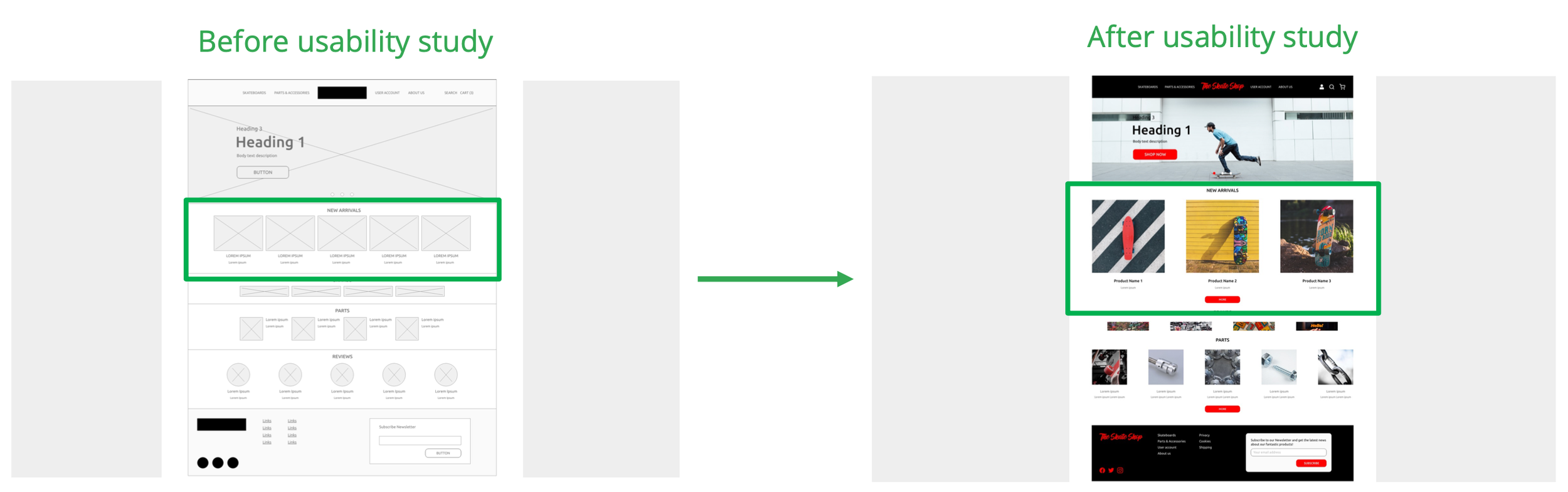
Usability: Participants wanted more space between products to make the visualization more easy.
Customization: Participants wanted to be able to add more than one Product at once to their cart.

Mockups
There were a few actionable insights I came up with from the usability studies. One of those was having more space between products, to make the overall visualization easier.
Another insights I came up with from the usability studies was having the possibility to add more than on product to the cart.

Mockups: Original screen size

Mockups: Screen size variations (mobile)


Accessibility considerations
I’ve add in consideration typography hierarchy, so in a layout divisions were created to help/show users where to focus and make it easier to find information.
In terms of colour, I’ve applied the 60-30-10 rule. Also used some accent colours to emphasize information, and at the same time all the app is communicating the branding.
In addition to colour I’ve also had the caution to use icons, so the overall design will be clearer to more users.

Takeaways
Impact:
The Website really made a impact on the users, they feel like the site meet their needs.
A quote from peer feedback:
“Using this site it’s the easiest way for me to find a way to upgrade my skateboard.”
What I learned:
Since the first contact with the Shop and “the problem”, throughout the entire process I’ve learned a lot, not only on a UI level but the all UX process was a real eye-opening for me. Listening to users and address their pain points and feedback, really made a strong impact in my designs decisions.
Next steps
I need to continuing measuring (analytics) the engagement with users, to understand the impact our updates made regarding it.
I will conduct when possible another Usability Study to have some inputs from new users. So it helps me to continue improving the User Experience.
I will want to ear from The Skate Shop experience as well, so they can give me an opinion about the impact on their business and see if their goals are being achieved.